A few weeks ago, I was doing some scouting for a music video project in Musselburgh. The band dropped their lead singer shortly after, so the project is on hold for now, but that is an entirely different story.
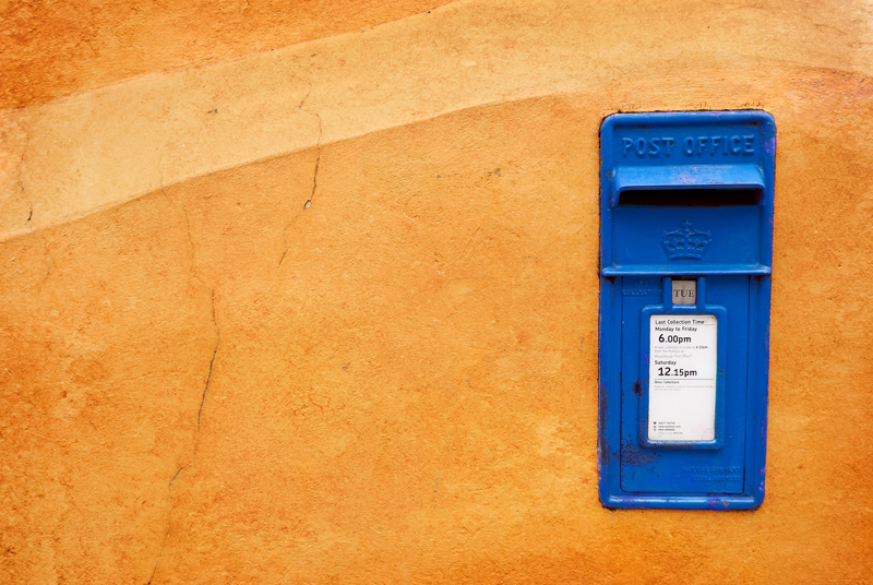
Since I was early for the meeting, I decided to walk around and do some sightseeing. An orange coloured wall soon attracted my attention for certain elements of design. Colour obviously, but also lines, texture, shape. I liked the mailbox in the wall, but not its colour. While red mailboxes can provide good colour contrast in quite a number of situations, it simply didn’t work for me with that orange wall. Nowadays if an object in the frame is the wrong colour, Photoshop can come to the rescue and the colour of the object can be changed. Which is what I did. A blue mailbox provides much better colour contrast against an orange wall. Don’t you think?
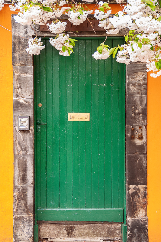
On the other hand, the green door worked just fine, so in this case I just left the colours alone.
The neighbours seemed to have taken notice of the wall and decided to be in harmony with the local colour scheme. The windows of that orange house intrigued me.