Marbles

“If we’re free from the burden of trying to be completely original, we can stop trying to make something out of nothing, and we can embrace influence instead of running away from it.” … Austin Kleon in “Steal Like an Artist”

In the spirit of this quote, I’ve been looking at Pinterest a lot lately for inspiration. In the midst of some random searches, I came across some pictures of marbles. And I thought it would be fun to experiment with that subject.

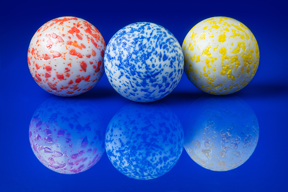
A few days later, an amazon delivery person showed up with a couple of marble jars. Because of the translucent nature of many of them, I first experimented with some backlight. But just simply backlighting these marbles wasn’t doing it for me, and I got the idea of putting each marble in an aluminium can. This way I got a reflection as well as the backlighting effect.

Backlit yellow marble
I put a sheet of white paper on the backend of the aluminium can and fired the speed light through the paper.
Backlit red marble
Once I had figured out the set up, it was just a matter of trying out different marbles.
Backlit blue marble
This blue marble was the last one for which the set up worked great. Backlighting can reveal all of the defects inside the marble. These didn’t have too many, unlike many others I tried.

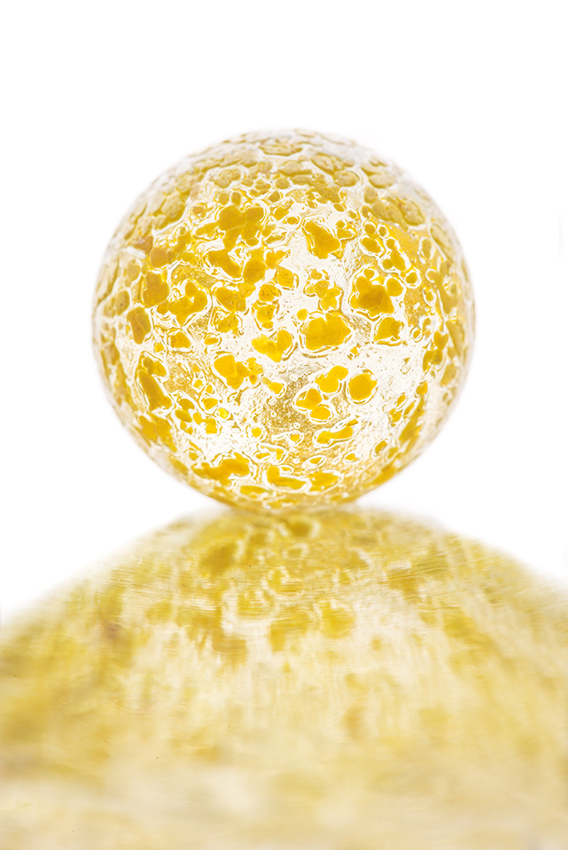
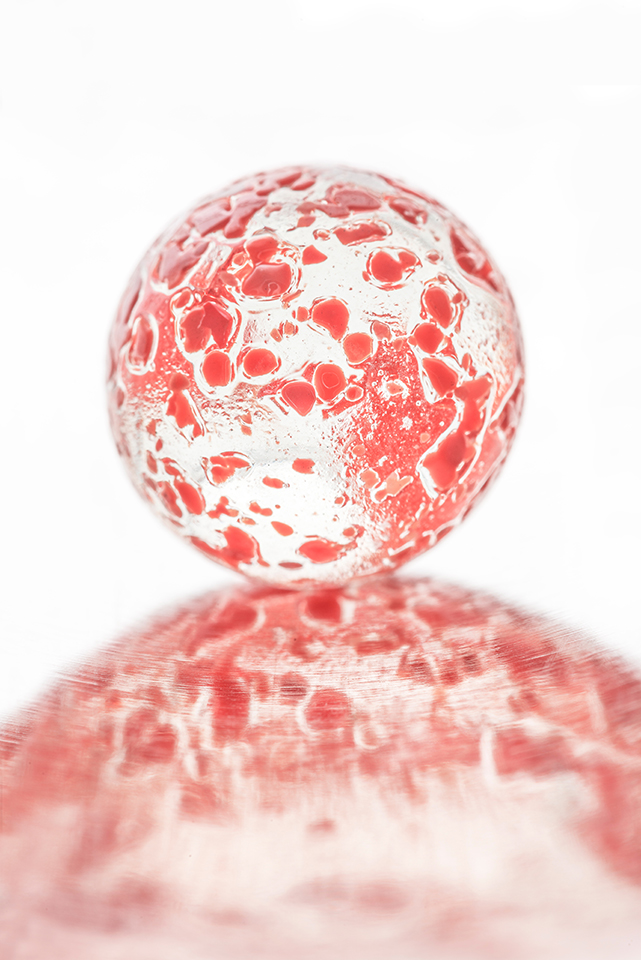
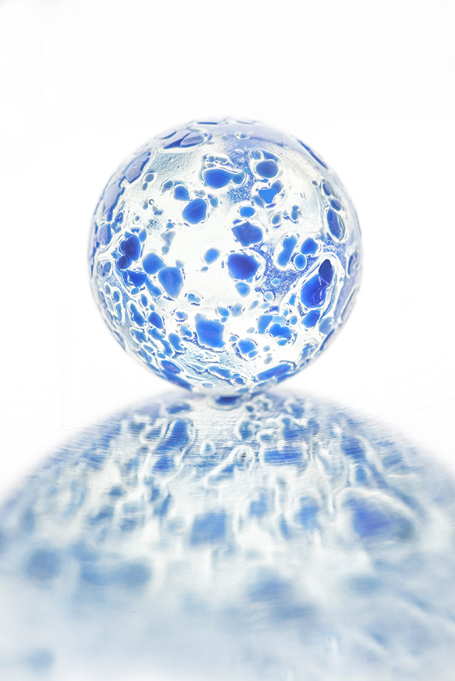
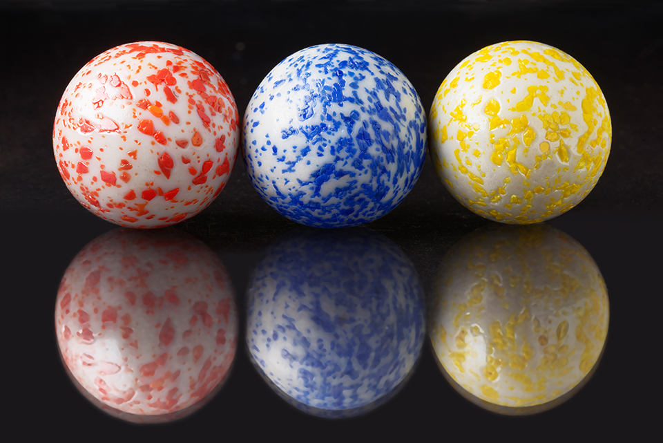
It took me a while to refine the method and edit the photos, and in the meantime I had taken Joel Grimes’ Still Life Masterclass. Joel got some incredible photos of mundane objects with just one light. He calls it “cross light” and when I heard it at first, it sounded too good to be true. The light is placed at ninety degrees and in front of the subject. With a softbox, the large light can wrap around the subject and give an amazing gradation of tones. You can adjust the contrast to taste with a reflector on the other side.

I wanted to see how this lighting scheme worked with marbles, and the rest of the pictures in this post were lit with a speed light in a soft box at ninety degrees, camera left, and a piece of white foam core used as a reflector. I still had some A4 coloured and transparent perpex sheets to put the marbles on.

Red, blue and yellow marbles
Started with the primary colours, red blue and yellow on my favourite colour background, blue.
Red, blue and yellow marbles
The marbles rest on a transparent sheet of perpex with white paper underneath.
Red, blue and yellow marbles
I replaced the white paper by black.

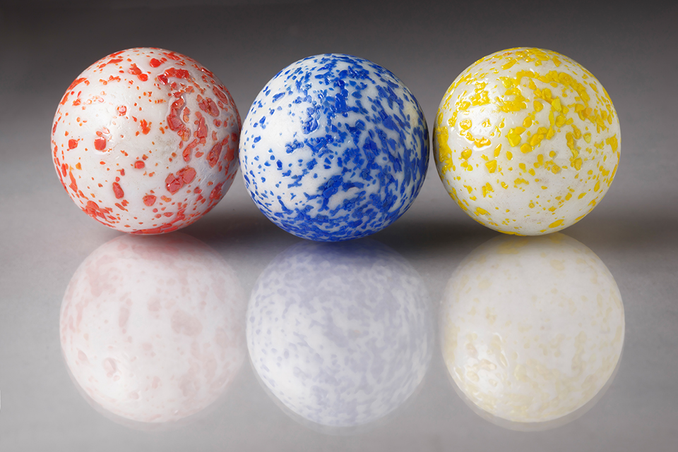
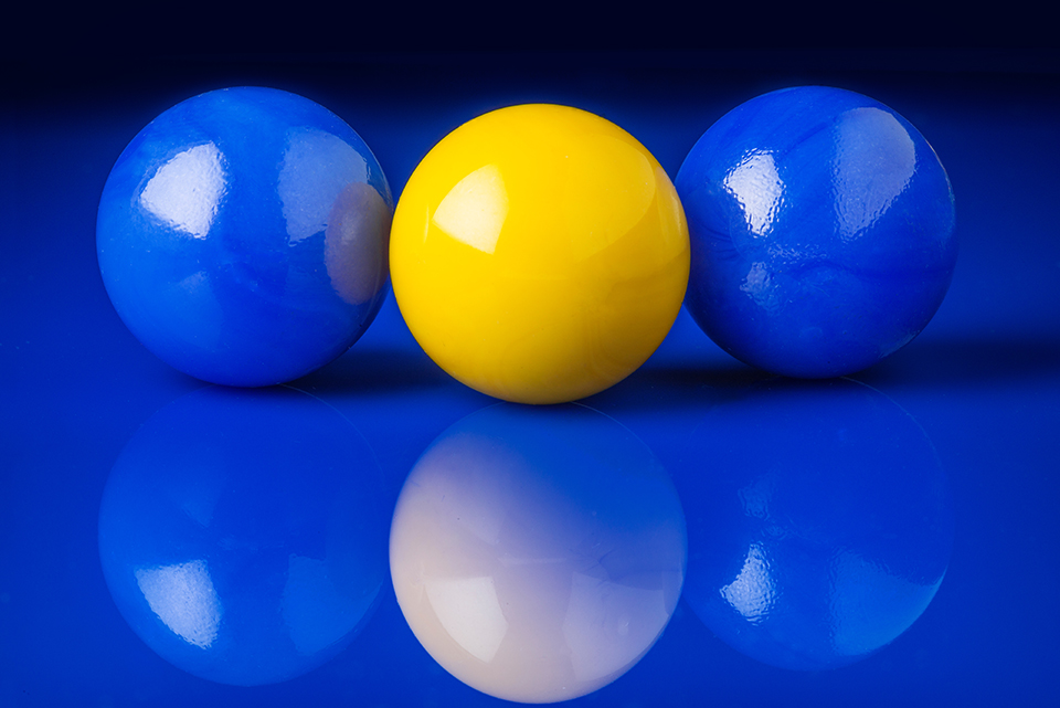
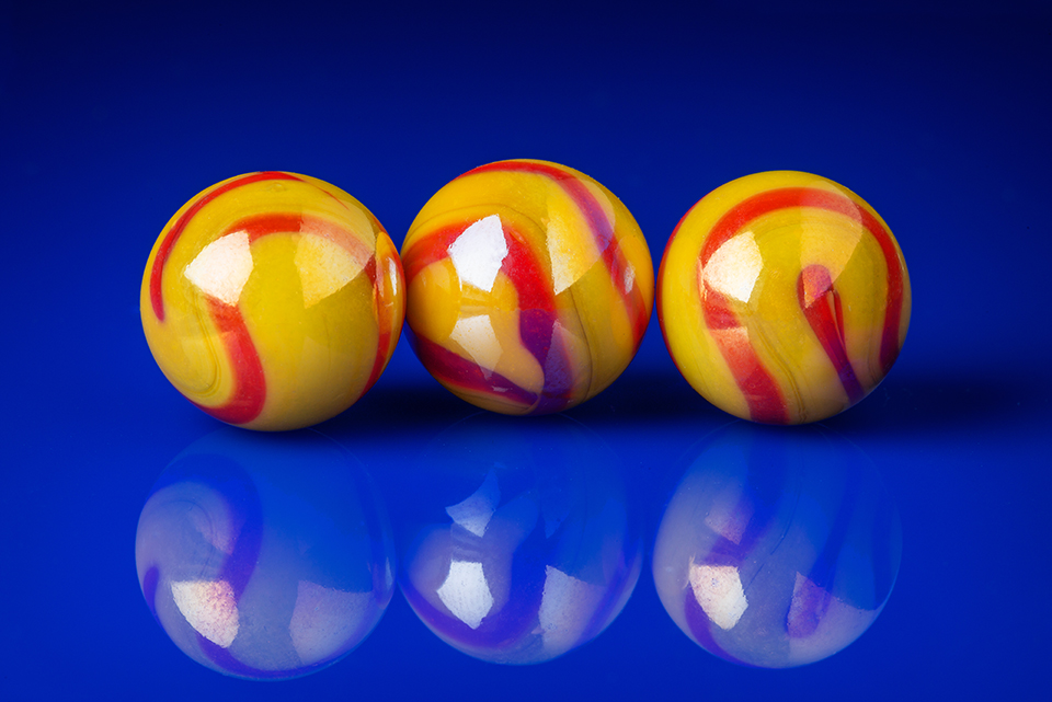
Next, I chose a background and picked marbles that I thought would work well with that colour. I first picked blue.

Coloured marbles on blue
Looking at complementary colours orange/blue. You can see the reflection of the soft box and reflector in the black marble.
Two blue marbles and one yellow marble
Blue on blue with yellow added for colour contrast.
White marbles
I liked this combination of marbles a lot.
Yellow/red marbles
Going for colour contrast here.

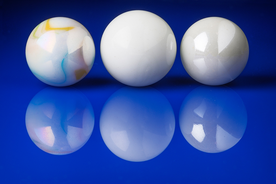
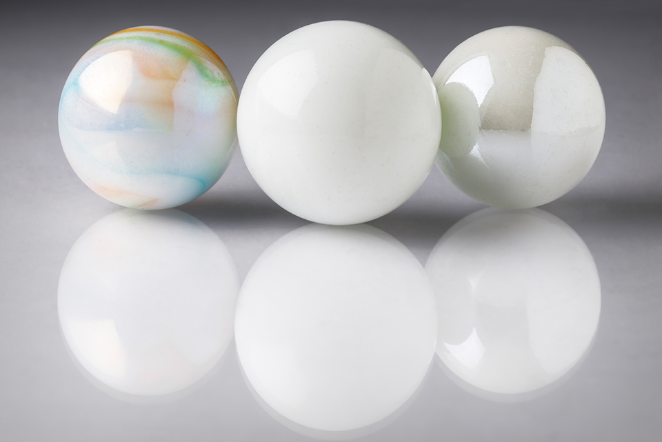
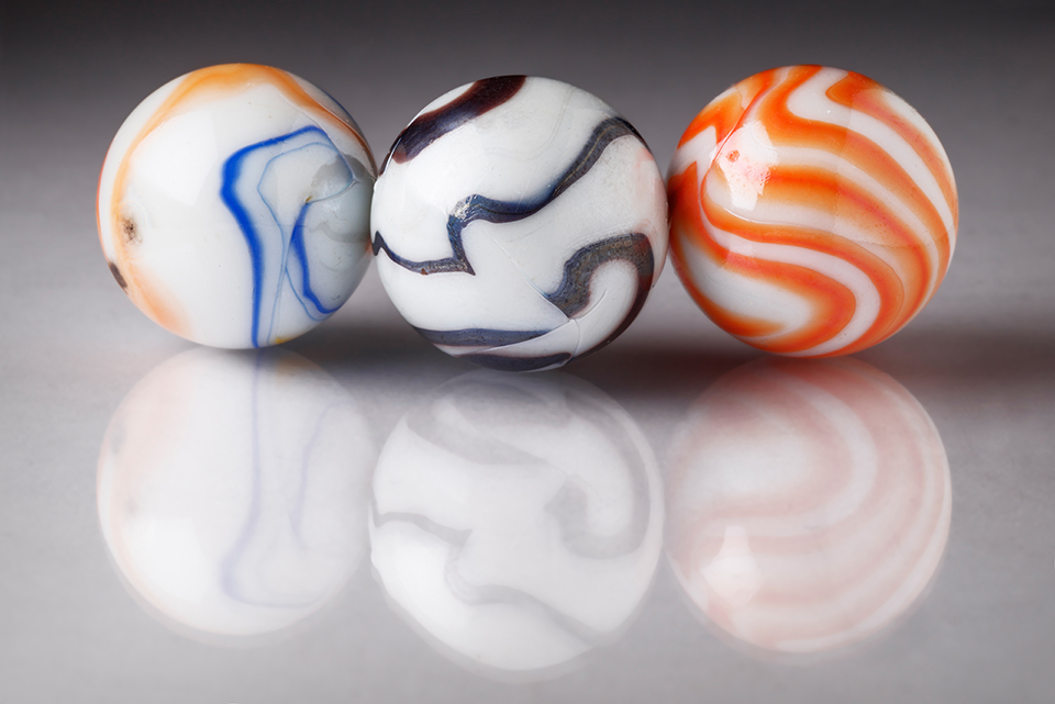
The next “colour” I tried is white.

White(ash) marbles
I really like the muted colours of this photograph.
Coloured marbles with reflections
Once I picked the black and white marble, I thought of using two coloured ones on each side to balance the composition.

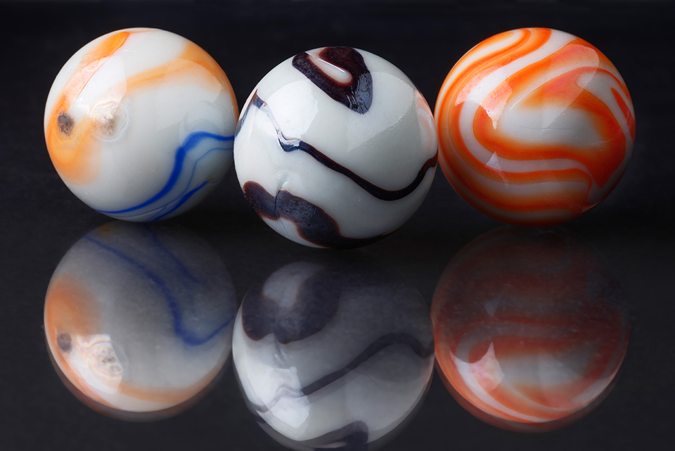
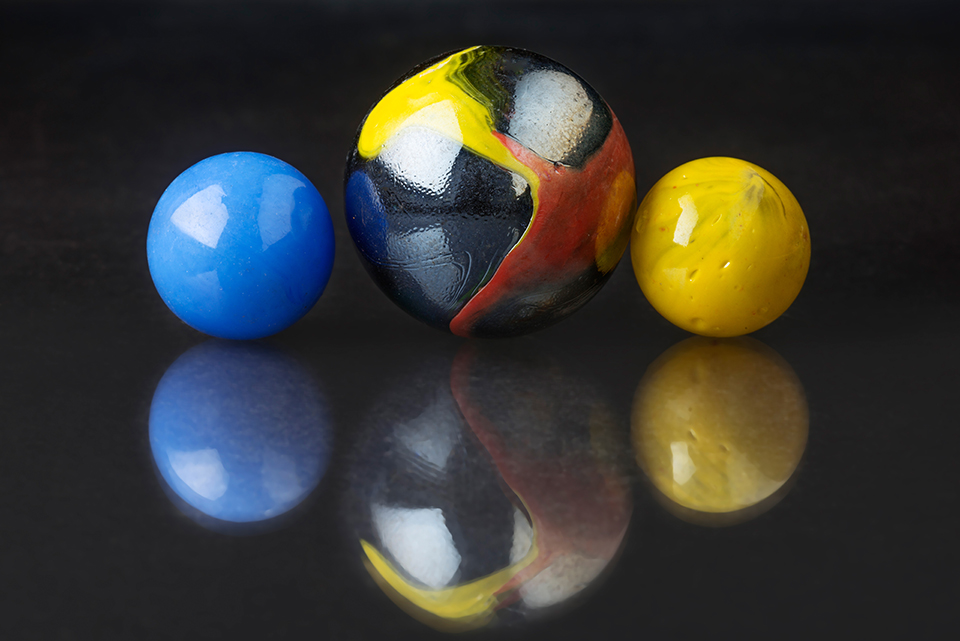
The obvious choice after white was black.

Black and white and coloured marbles
I needed to try the same combination of marbles but on black this time.
Big marble and small marbles
Black on black background is difficult to shoot. The reflections of the coloured marbles help bring some separation from the background.
Yellow/red marbles
For this combination of marbles, I do prefer the blue background. Don’t you?
Green marbles
The “cross light” doesn’t show the many imperfections in the mostly transparent big marble. Backlighting it would have.
Orange marbles
Wish I had that combination of marbles on blue plexiglas. I probably will shoot it at some later time.

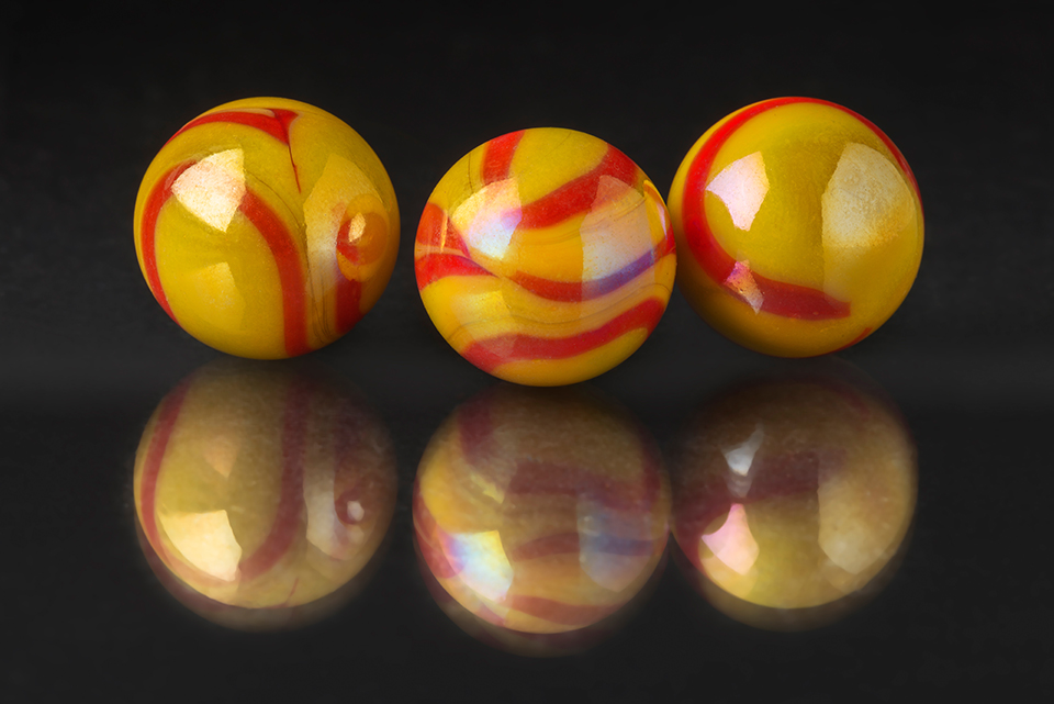
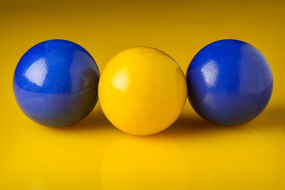
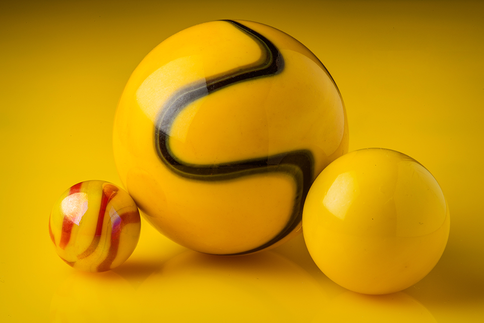
I then did a couple of combinations on a yellow background.

Blue and yellow marbles
I had to test the “inverse” or “negative” of a previous set up. Two blue marbles and a yellow on yellow, as opposed to two blue marbles and a yellow on blue.
Three yellow marbles
Quasi-monochrome composition. A touch of black and red on yellow.

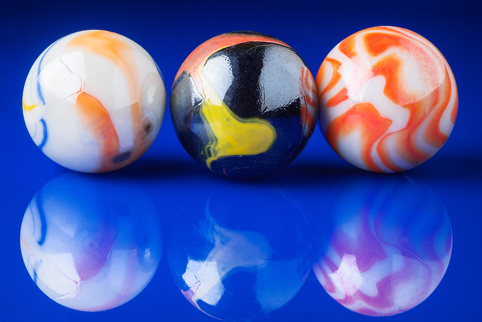
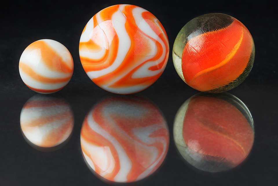
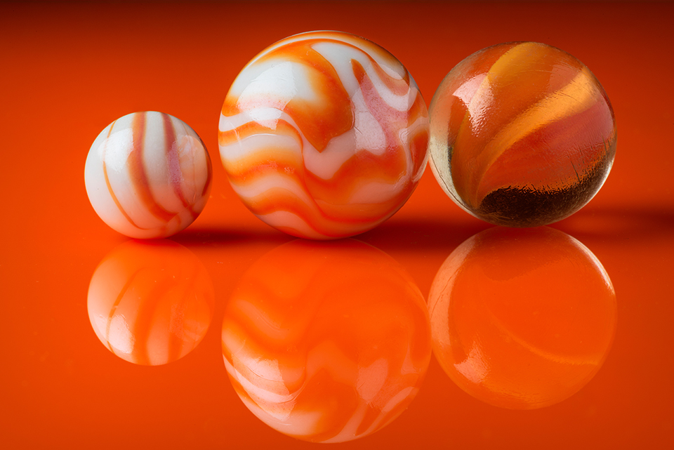
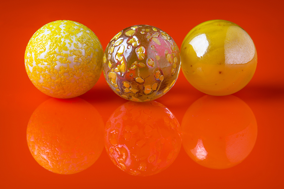
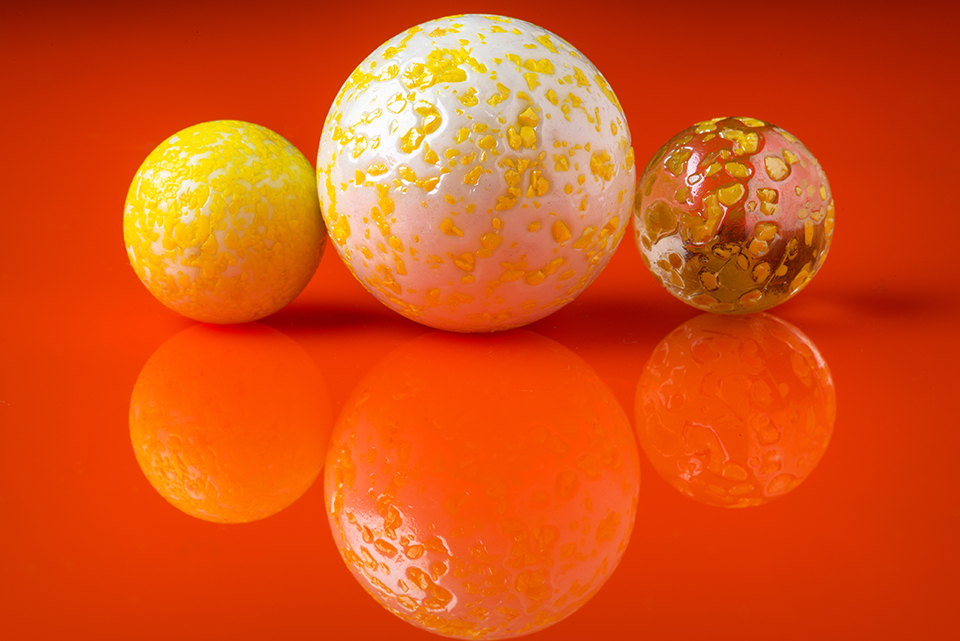
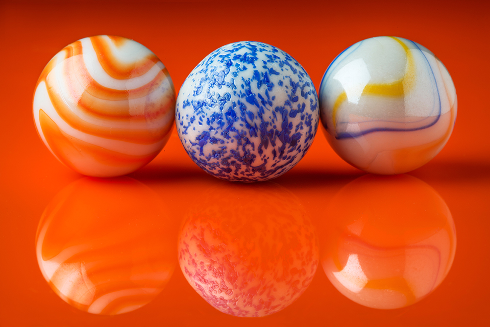
Since I wasn’t too fond of the yellow background, I moved to my final set ups, using an orange sheet of plexiglas.

Three orange marbles
I like this quasi-monochrome composition better than the yellow one.
Three yellow marbles
Moving to “similar” or adjacent (on the colour wheel) colours in yellow and orange.
Two yellow and a white/yellow marble
Slight variation of the above colour scheme.
Orange, blue, white yellow and blue marbles.
Finally adding some colour contrast with the blue marble.


Share this content on Facebooktwitterredditpinterestlinkedinmailby feather