We are not very good at judging things in absolute terms. Is £100 for that brand X widget a good deal? Who knows? But when that deal is compared, or contrasted, to the offers from the competition, like brand Y widget costs twice as much with half the features, then we get to think that £100 for that brand X widget is a pretty good deal after all.
Savvy marketers know that you can use the power of contrast to be more persuasive. The classic example is that of the discounted price. The new price is contrasted to the old one to give the potential customer a good reason to buy.
And if your real estate agent takes you around to show you a few houses, it is a safe bet that the first one is going to be expensive and in need of a bit of ‘freshening up’. By contrast, the subsequent houses you visit will all look like great bargains.

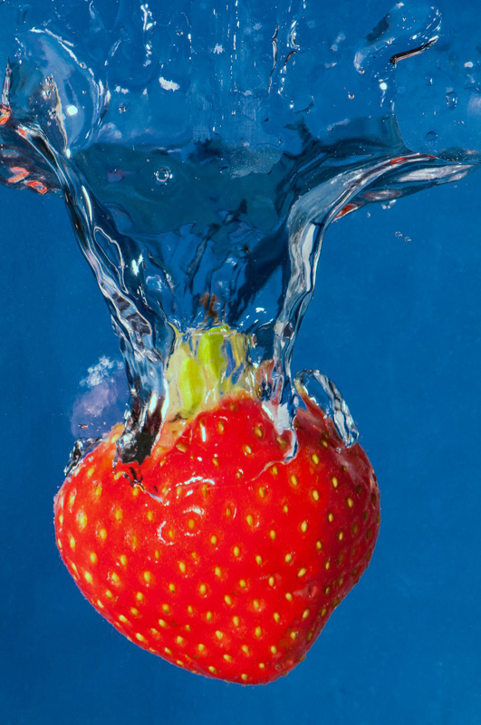
In other words, marketers use contrast to make their offer stand out. And photographers also use contrast to make their subject ‘pop’ from the photograph. In an image, one can use tone contrast, a bright subject against a dark background for example, or sharpness contrast, where a sharp subject stands out from an out of focus background. The photograph above uses colour contrast to make the red strawberry ‘pop’ from the blue background. The use of contrast can be just as effective in photography as it is in marketing.
Share this content on
