The color you use to paint a room can influence the mood and energy level of the place you are decorating. For example, the color red can increase blood pressure. The way we respond to color is also determined by cultural factors. For instance, in Western countries, white is associated with purity and innocence. In many Eastern countries, it is a symbol of mourning.
One can set a playful mood with primary colors, like red, blue and yellow. Or use cooler muted colors such as sage green and sky blue for a calmer ambiance. You won’t often see a bedroom with red walls, but it may be a good idea to use bright colors in an office space.
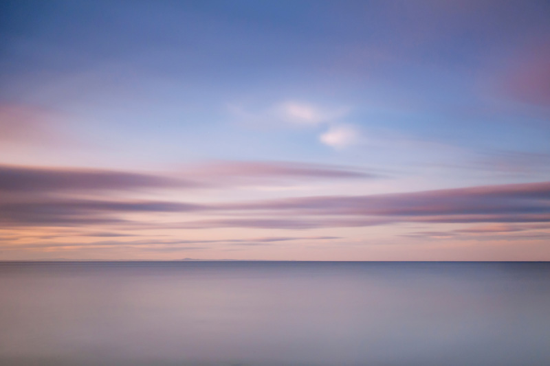
The light and colors in a photograph can evoke similar emotions in the viewer. We had a week of great weather in Edinburgh, and I was able to take a number of photographs. The picture below was taken from Portobello beach a bit before sunset. Note how the pale sky blue, orange, red colors and low contrast give the scene a calm and peaceful mood.
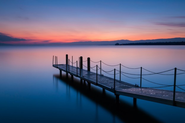
Compare the above to the photograph I took a while back in Lausanne, Switzerland. The color palette is about the same: blue, orange and red, but the darker colors and greater contrast create a more subdued, sombre mood.

Share this content on